Grey marble can look crisp and quiet, but the wrong surrounding colors may make it feel cold. Its veining can shift from soft silver to charcoal, so the best palette depends on the stone itself. In 2026, designers are pairing grey marble with warm, natural tones and selective color rather than relying on all-white rooms. What are the best colors to pair with grey marble? Sage green, muted blue, warm beige, and deep brown are strong options, each creating a different mood. The details matter.
Sage cabinetry can soften a grey marble island, while brushed brass handles add a gentle warmth. For a calmer bathroom, try muted blue walls with pale grey tile and white towels. Beige, oak, and cream work well when you want the stone to feel less formal. Deep brown or forest green can bring depth, especially in a room with good natural light. Small samples help. Check them beside the marble in morning and evening light; a color that looks balanced in a showroom may turn dull at home. I have seen even lovely combinations feel too busy when the stone has bold veining and the paint adds another strong pattern. That is worth reconsidering. These pairings are starting points, not rules. The most reliable choice is the one that suits the marble’s undertone, the room’s lighting, and the finishes you will see every day.
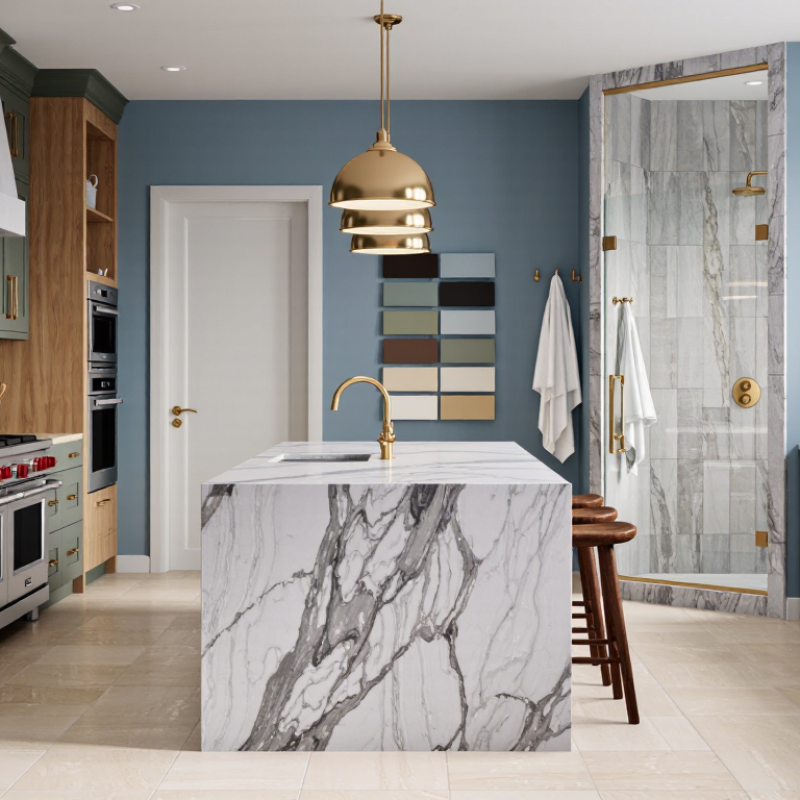
Grey marble is not simply “cool grey.” Its base may lean blue, green, beige, or violet, and those undertones change how nearby paint and cabinetry read. Hold a sample beside warm white, muted sage, or deep navy, then check it in the room’s actual daylight and evening lighting. Warm LEDs can make a blue-grey slab feel colder by contrast. Look closely.
Veining matters just as much. Fine white threads suit quieter palettes; bold charcoal or rust-colored veins can guide accent colors and hardware finishes. Match one small detail, not every line in the stone.
The 2024 Houzz U.S. Kitchen Trends Study reported quartz in 42% of renovated kitchens’ countertop selections, compared with granite at 24% and quartzite at 11%. Those figures describe material choices, not preferred marble colors, but they show how many homeowners weigh stone-like surfaces against alternatives.
For grey marble, view the full slab where possible: a small sample can hide a dramatic vein or a warmer patch. I have found that a “safe” neutral paint sometimes looks oddly pink beside certain slabs, so test larger swatches before committing.
Grey marble can read cool, especially when its veins lean blue or charcoal. Crisp white cabinetry keeps the room bright, but it can make a pale slab feel stark. Compare samples beside the marble in morning and evening light; a white that looks gentle in a showroom may turn icy at home. That matters.
Cream offers a softer transition. Try it on walls, upholstery, or cabinet fronts, and let the marble’s veining guide the undertone. Beige with a slight taupe cast often sits comfortably beside grey, while yellowish cream may clash with blue-grey stone. The difference can be subtle. It is still visible.
Other neutrals, such as warm greige, oatmeal, and muted stone, create depth without competing for attention. Use one as the main background, then vary texture: matte paint, woven linen, or lightly grained wood. Too many similar tones can make a room feel flat, though. A darker charcoal detail or a small area of clean white can restore definition. Before committing, place large samples together near the floor and countertop, not just on a mood board. I would not trust a tiny swatch alone.
Grey marble often has blue, silver, or warm beige veining, and that undertone affects which earthy colors feel natural beside it. Terracotta, muted rust, and clay bring warmth without hiding the stone’s pattern. Try them on a painted wall, a linen shade, or a small ceramic object before committing. Small changes matter. In north-facing rooms, warm colors can soften the cooler daylight; in sunny spaces, dusty olive or soft ochre may feel calmer. Look at samples beside the marble at different times of day, since artificial lighting can shift both colors noticeably.
Wood adds another layer of warmth. Walnut and medium-toned oak often complement grey stone, while very red wood can compete with its veining. For a quieter palette, pair grey marble with warm taupe, sand, or olive green, then use a textured fabric to keep the room from feeling flat. Matte finishes tend to look gentler beside polished stone. Not every pairing works. A rich rust cushion may look inviting in a sample, yet dominate a small room once repeated across curtains and upholstery. Start with one earthy accent, live with it for a few days, and adjust before adding more.
Grey marble has cool veining, but its undertone can shift from blue to warm taupe. Look at a sample beside your cabinets and flooring, not under showroom lights alone. Deep emerald, sapphire, and burgundy create vivid contrast against pale grey stone. A narrow velvet stool, glazed vase, or painted island can introduce color without overwhelming the veining. Keep it restrained. One strong accent often looks more intentional than several competing jewel tones.
For a softer effect, pair charcoal marble with amber, rust, or muted plum. These warmer shades balance the stone’s coolness, especially in rooms with wood floors or brass details. Repeat the accent once or twice, such as in a pendant and a small textile, to make the palette feel connected. Test it at home. Natural light changes color through the day, and a shade that looks rich at noon may seem almost black by evening. Large areas of saturated paint can also make a small room feel heavy; that can be striking, but it is not always comfortable. For countertops, check the stone’s care guidance before placing dyed fabrics or strongly pigmented items nearby. A little restraint—and a willingness to revise the palette—usually serves the marble better than matching every detail.
| Accent Color | Digital Color Reference | How It Pairs With Grey Marble | Suggested Uses | Balancing Tip |
|---|---|---|---|---|
| Emerald Green | #146B50 | Adds a rich, natural-looking contrast to cool grey veining and works especially well with lighter marble. | Cabinet fronts, velvet seating, towels, or decorative accessories. | Pair with warm wood or muted brass tones to soften the contrast. |
| Sapphire Blue | #2457A6 | Creates a crisp, dramatic pairing with pale grey marble; deeper grey stone gives the combination a more subdued feel. | Accent chairs, painted cabinetry, artwork, or small furnishings. | Use in measured areas and keep larger surfaces neutral to maintain visual balance. |
| Deep Teal | #146B68 | Brings together blue and green undertones, complementing many cool-grey stones without relying on a stark contrast. | Vanity cabinetry, cushions, feature walls, or upholstered furniture. | Repeat the teal in one or two smaller details for a cohesive look. |
| Burgundy | #762F3E | Its warm red undertone contrasts with cool grey and can make a room feel more layered and intimate. | Dining chairs, rugs, curtains, or decorative objects. | Balance it with light grey, cream, or soft white so the room does not feel too heavy. |
| Amethyst Purple | #704A8E | Provides a jewel-toned accent that sits comfortably with cool grey, particularly in contemporary interiors. | Textiles, artwork, glass accessories, or a single upholstered piece. | Choose a muted purple for a quieter effect, or a deeper shade for stronger contrast. |
| Ochre | #B47A24 | Adds warmth against grey’s cool appearance and creates a noticeable but less jewel-like contrast. | Accent cushions, ceramic pieces, lampshades, or occasional furniture. | Keep the ochre to accents when the marble has prominent veining. |
| Terracotta | #B65D43 | Introduces an earthy, warm counterpoint to grey marble and pairs naturally with wood and linen textures. | Planters, soft furnishings, rugs, or painted accessories. | Use a softer, dusty terracotta alongside dark grey marble for a gentler transition. |
| Soft White | #F2F0EA | Creates a light, restrained backdrop that lets the marble’s veining remain a focal point. | Walls, cabinetry, bedding, or larger furniture surfaces. | Combine with one saturated accent color to add depth and prevent a flat look. |
Color pairings are design suggestions; the appearance of grey marble varies with its base tone, veining, finish, and lighting. Hex values are digital color references and may look different on physical materials and screens.
Grey marble changes character with its room, light, and surface finish. In a north-facing kitchen, cool daylight can make blue-grey veining feel sharper. Pair it with warm white cabinets, pale oak, or muted clay to soften the effect. Under warm evening bulbs, those same tones may look more beige than expected. Test large samples at different hours. A small chip rarely tells the whole story.
In bathrooms, soft sage or dusty blue can sit comfortably beside grey marble, especially when the stone has a honed finish. Honed surfaces scatter light and feel quieter; polished marble reflects windows and lamps, so strong colors may appear brighter. For a compact room, use deeper charcoal or forest green in small areas, such as a vanity front or painted niche. Keep grout and metal finishes in the same temperature family. It helps. Still, matching every undertone can make a room feel too carefully planned. One warmer detail, like a linen shade or natural wood stool, often brings balance. Check samples beside the actual stone, not a screen.
Grey marble may lean blue, green, beige, or violet. These undertones can change how nearby paint and cabinets appear.
Place large paint samples beside the actual stone. Check them in morning daylight and evening light. Tiny chips can mislead.
Crisp white keeps a room bright, but may make pale marble feel stark. Warm white can soften cool blue-grey veining.
Yes. Taupe-leaning beige often feels comfortable beside grey. Yellowish cream may clash with blue-grey stone. Subtle, but noticeable.
Use one small detail, such as a cabinet handle or accent color, to echo a vein. Matching every line can feel forced.
Cool daylight can sharpen blue-grey veins. Try warm white cabinets, pale oak, or muted clay to add warmth.
Soft sage and dusty blue can work well. In a compact room, use charcoal or forest green in a small area, such as a vanity front.
Yes. Honed marble scatters light and feels quieter. Polished marble reflects lamps and windows, making nearby colors appear brighter. Check it in person.
What are the best colors to pair with grey marble? The answer depends on its undertones and veining. Cool grey marble with blue or silver details often looks balanced beside crisp white, soft grey, or muted blue, while warmer stone with beige or taupe veining pairs naturally with cream, ivory, and sandy neutrals. These lighter shades keep a room feeling open and let the marble’s pattern remain a focal point.
For added warmth, consider earthy colors such as terracotta, olive, clay, or muted brown. Deep green, navy, burgundy, and other jewel tones can create a richer contrast when used thoughtfully in accents. The right choice also depends on the room’s natural and artificial light, the amount of marble, and whether its finish is polished or honed. Testing colors beside the stone in the actual space can help reveal how their tones change throughout the day.

Gem Marble